
AI upscaling has made it easy to turn a grainy 800-pixel product shot or an old team photo into a crisp 4K image. The catch is that a sharper image is usually a heavier one, and heavy images are the most common reason a page feels slow.
That matters because images sit at the centre of how Google measures page experience. According to the HTTP Archive’s 2025 Web Almanac, an image is the Largest Contentful Paint (LCP) element on 76% of mobile pages and 85.3% of desktop pages. Only 62% of mobile sites achieve a “good” LCP score, and just 48% of mobile sites pass all three Core Web Vitals.
For Australian small businesses, where many customers first meet you on a phone, the hero image on your home page is often the single biggest factor in whether your site passes or fails.
Quick answer: Upscale images only to the largest size they will actually be displayed at, then compress them to a modern format (WebP or AVIF), serve smaller versions to smaller screens with srcset, always set width and height, and never lazy-load the main above-the-fold image. Done this way, upscaling improves visual quality without hurting LCP or CLS.
Image upscaling increases an image’s pixel dimensions. Traditional resizing stretches existing pixels, which looks soft. AI upscalers instead predict and fill in new detail, so edges, text and textures stay sharp at larger sizes.
That is genuinely useful when you are working with:
The problem is what happens after upscaling. Doubling an image’s width and height gives it four times as many pixels. Unless it is re-compressed and resized for delivery, that extra data travels to every visitor, including someone on a mid-range phone and a patchy 4G connection.
1. Upscaling beyond display size. A 4000-pixel image shown in a 1200-pixel slot wastes most of its bytes.
2. Exporting in a legacy format. The 2025 Web Almanac found JPG still makes up 57% of LCP images and PNG 26%, while WebP is 11% and AVIF under 1%.
3. Uploading one file for every screen. A phone downloads the same desktop-sized banner.
4. Dropping width and height attributes. New image files often get placed without dimensions, which causes layout shift.
5. Letting a plugin lazy-load everything. Including the hero image the visitor sees first.
Core Web Vitals are Google’s three field metrics for real-user experience: loading (LCP), responsiveness (INP) and visual stability (CLS). A page passes when at least 75% of real visits meet the “good” threshold for all three; one failing metric fails the page.
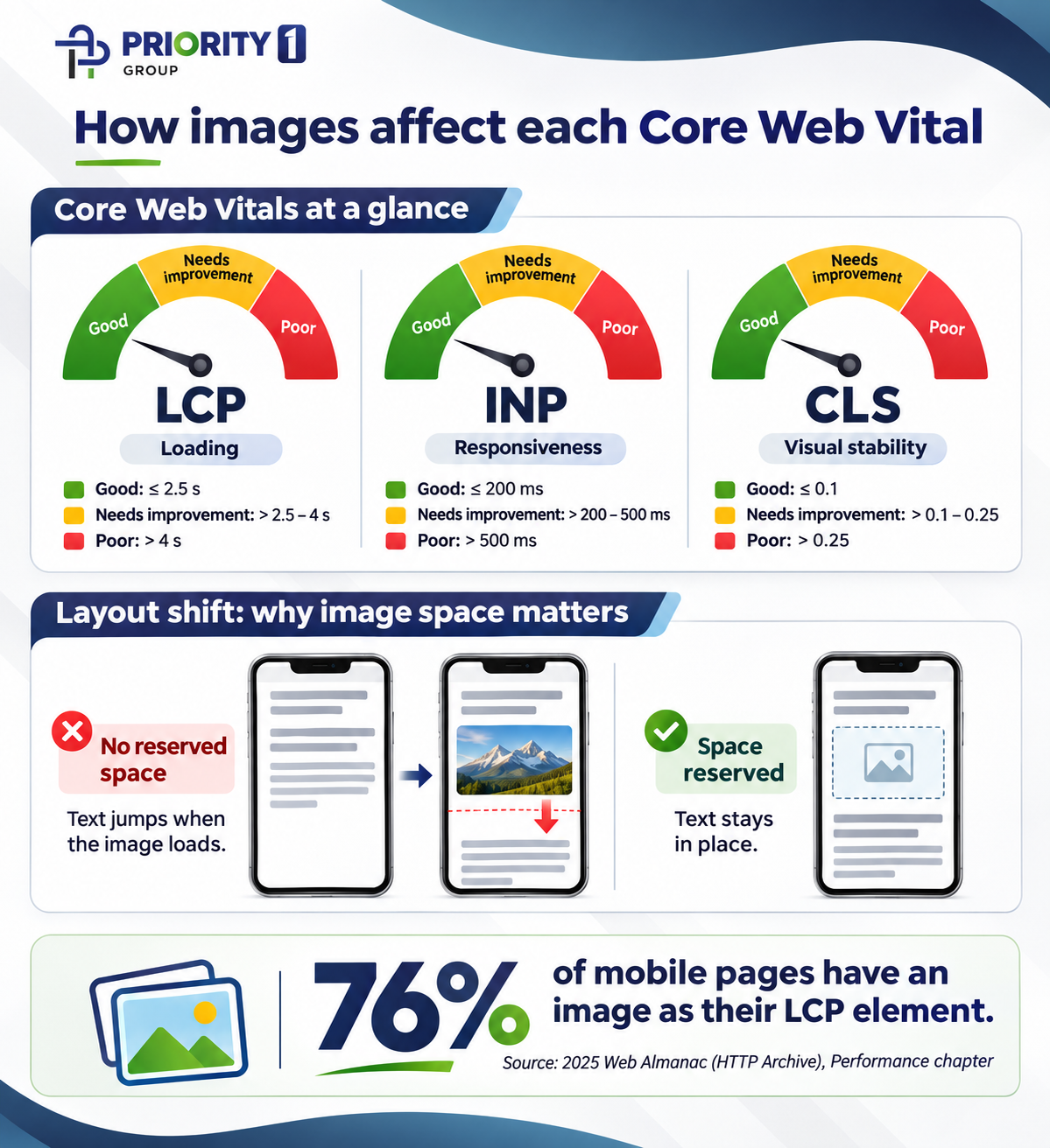
Thresholds as published on web.dev. INP replaced First Input Delay as a Core Web Vital in March 2024.
LCP is the hardest of the three to pass on mobile. The 2025 Web Almanac reports “good” mobile pass rates of 62% for LCP, 77% for INP, and 81% for CLS. Because an image is the LCP element on most pages, image handling is usually the fastest route to a better score.
The same report found 62% of mobile pages fail to set dimensions on at least one image. Upscaled replacements can easily add to the problem: a new file is swapped in through the CMS and the original width and height values are lost.
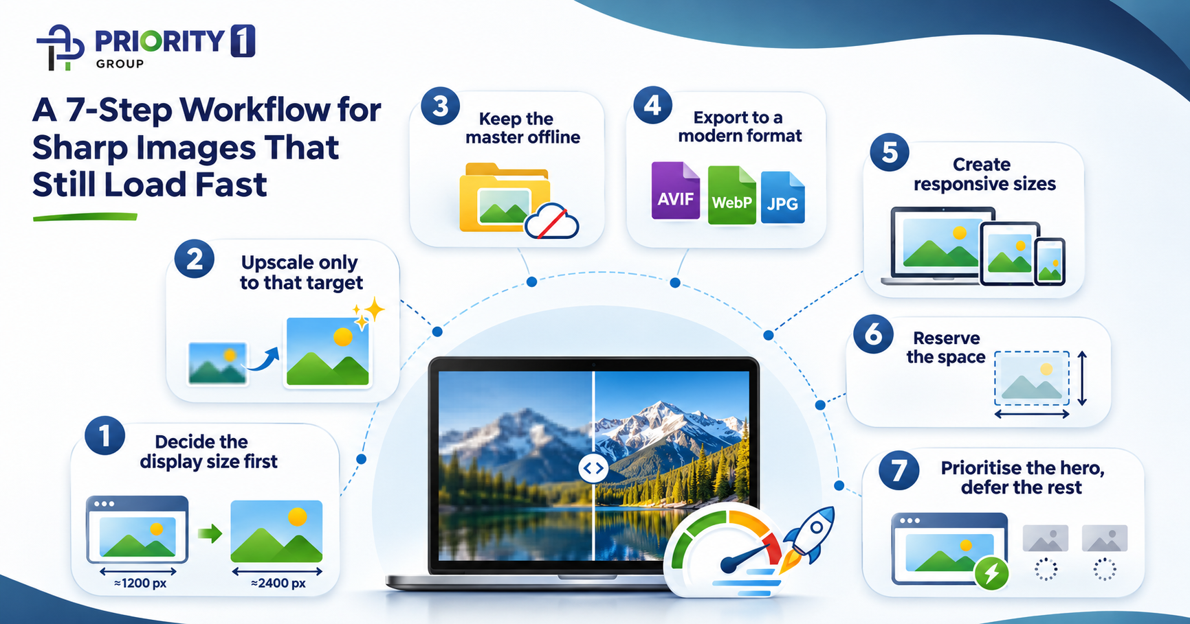
The balance comes from separating two jobs: making a high-quality master image, and delivering the lightest version each visitor needs. Follow these steps in order.
1. Decide the display size first. Measure the largest slot the image fills on desktop, then multiply by 2 for high-density screens. A hero shown at 1200 px wide needs a master of about 2400 px, not 6000 px.
2. Upscale only to that target. Use your AI upscaler to reach the target width and stop there. Check faces, text and logos at 100% zoom, as upscalers can invent detail that looks wrong.
3. Keep the master offline. Store the full-quality upscaled file in your asset library, not on the live site. The website gets optimised derivatives only.
4. Export to a modern format. Serve AVIF or WebP with a JPG fallback using the <picture> element. Keep PNG for graphics that genuinely need transparency or sharp text.
5. Create responsive sizes. Generate several widths (for example 480, 800, 1200 and 2400 px) and let the browser choose with srcset and sizes. Most CMS platforms, including WordPress, generate these sizes automatically when set up correctly.
6. Reserve the space. Always include width and height attributes, or a CSS aspect-ratio, so the browser holds the right space before the file arrives.
7. Prioritise the hero, defer the rest. Add fetchpriority=”high” to the main above-the-fold image and never give it loading=”lazy”. Lazy-load images further down the page.
<picture>
<source type=”image/avif” srcset=”hero-800.avif 800w, hero-1200.avif 1200w, hero-2400.avif 2400w” sizes=”100vw”>
<source type=”image/webp” srcset=”hero-800.webp 800w, hero-1200.webp 1200w, hero-2400.webp 2400w” sizes=”100vw”>
<img src=”hero-1200.jpg” width=”1200″ height=”600″ alt=”Describe the image for screen readers and search” fetchpriority=”high”>
</picture>
Images further down the page use the same pattern with loading=”lazy” in place of fetchpriority.
The 2025 Web Almanac found that about 16–17% of pages still lazy-load their LCP image, which tells the browser to wait before fetching the very element Google is timing. Chrome’s own guidance is to use fetchpriority=”high” on the LCP image and never combine it with loading=”lazy”. Yet only around 17% of mobile pages with an LCP image use fetchpriority=”high” at all.
On WordPress sites, a common cause is an optimisation plugin applying lazy loading to every image. It is worth checking your plugin settings to exclude the first image or two on each template.
Judge success by real-visitor data, not a single lab score. The 0–100 PageSpeed Insights performance score is a simulated test on one device; Core Web Vitals are based on what real Chrome users experienced over the previous 28 days.
Field data takes time to update, so allow several weeks after a change before judging the result.
Image quality and page speed are not separate projects. The same hero image shapes your first impression, your Core Web Vitals and how well your paid and social traffic converts once it lands.
For online stores, the trade-off is sharpest: catalogues often hold hundreds of supplier photos that need upscaling to look professional. We covered the broader growth picture for retailers in how digital marketing agencies help e-commerce brands thrive; image delivery is one of the technical foundations underneath it.
At Priority1 Group, image optimisation is built into how we approach:
If your site looks great but scores poorly, or your images look soft and you are worried about slowing things down, talk to our team or call 1300 000 450. You can also explore our full range of digital marketing services.
It can. Upscaling adds pixels, and more pixels mean larger files unless the image is re-compressed and resized for delivery. Upscale only to about twice the display size, export to WebP or AVIF, and serve responsive sizes to keep the speed cost minimal.
About twice the largest width the image is displayed at, to stay sharp on high-density screens. A banner shown 1200 pixels wide needs a source of roughly 2400 pixels, with smaller versions served to phones through srcset.
Both are far smaller than JPG or PNG at similar quality, which shortens image download time and helps LCP. AVIF usually compresses further, while WebP encodes faster and has longer-standing tool support. Serving AVIF with WebP and JPG fallbacks via <picture> covers every browser.
No. Lazy-load images below the fold only. The main image visible on first load should load immediately with fetchpriority=”high”, because lazy-loading it delays your Largest Contentful Paint.
The images are probably missing width and height attributes, so the browser does not reserve space for them. Adding dimensions or a CSS aspect-ratio fixes most image-related Cumulative Layout Shift.
Core Web Vitals are part of Google’s page experience signals, but relevant, helpful content still matters most. Their bigger commercial value is user experience: a faster, stable page keeps visitors engaged and makes paid and organic traffic more likely to convert.